


CloudOn
Tablet
Redesigning a flagship product
Sr Product Designer
2013
CloudOn (acquired by Dropbox) was a leading productivity app. We were a tablet first startup, but we had accumulated a massive design and engineering debt with a rapid product evolution and launching its other counterparts, mobile and the web. Most of the user base was on the tablet and their experience was less than ideal. This was great opportunity to leap forward with the new design language that can scale while providing a cohesive user experience across the platform. An experience you can expect from a flagship product.


we wanted to
completely redesign the product experience to accommodate the next wave of our product offering. I strived for a holistic approach to a scalable design language that can unify our product experiences across multiple platforms. This design would become the foundation for future updates.
but its easier said than done
A redesign is not a small feat, let alone establishing new UX roots at the same time when engineering is also 'redesigning' their code. A lot of moving pieces. Biggest risks with such projects are changing it too much and hurting the userbase. We had accumulated a big design debt and with a future feature set in sight, accommodate the next round of product updates. Given all that, the biggest challenge we faced was mitigating the risk of deserting the current userbase, hurting the core user experience or add a steep learning curve.


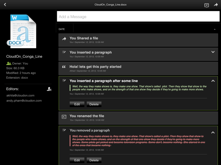
Old Product


Pencil and Paper
Bringing design closer to mobile client was one the step in right direction. Bigger screen real estate meant opportunity to play with some concepts not possible on mobile and add unique value to tablet product.


Improving the Flow
One of the big drawbacks with the old flow was that it required new users to connect at least one cloud services to access their files. It seemed logical then, but a strong friction point for potential users. I redesigned the flow so that everyone who signs up is welcomed by a home screen with an option to try one of the sample files to give them a good sense of the product before they can commit.


Wires
Lot of exploration during this phase, touching every aspect of the design. Some of them even sounded crazy back then. Like fully expandable cards with breaks at certain stages, going from tiny file card to all the way to filespace. The file editor concept even helped us kickstart a whole new skunkworks project to build a brand new file editor.


Going Light
We had a massive asset library, due to repetitive file type icons in multiple resolution. To scale the design, I boiled down them to total 6 icons to cover all the filetypes and converted them to icon font. Reduce the app size in the process.


Interfaces
Visual refresh was one driving force for this redesign. The previous visual design felt dated, and the dark UI had some legibility and contrast issues outdoors. I always envisioned a light UI for the content focused app, where visual becomes almost invisible and surfaces takes the foreground. It also opened up working with light colors and opportunity to establish a color hierarchy in the UI. It looked fresh and the response was great from the users and stakeholders alike.


Move that file
The Cut, copy & paste trio is great for desktop, but the use case was slim for our mobile product. After some quick user research, it turned out that users were using it just to move or duplicate files. So I simplified this two-step process of cut/copy and paste to just one, move. And provided a duplicate feature for the 'copy' use case.


Breeze Design System
One of the goal I wanted to accomplish, coming out of this redesign was to scale the efforts to the entire product family. While designing this I made sure that it was responsive enough to scale up or down. I deconstructed the UI to its core elements and defined them, taking a hint from the atomic design approach. This reduced the design dependency between design and development. Developers were able to put together a mobile UI on their own. Success!


Testing
We had an advocacy group at cloudon, a group mix of super users and evangelist. They represented personas we were designing for, so we constantly tapped into that pool throughout the process. We had testing at pretty much every stage, we had a paper prototype early on in the process for internal feedback. Once the UI was good enough, we wrapped it in a click-through prototype around in local coffee shops to get some initial reaction and then iterate on it. At a much later stage, we organized an in-house user study with some of our top users. The feedback stayed positive throughout as the product and design both had evolved to a better stage.

